Thursday, August 7, 2008

Star plots


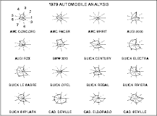
Star plots a graphical representions of a variety of different data about a single thing. This Star plot shows the differences between automobiles in 1979, everything from price, to safety, to gas milages was shown in a way to visualize the best buy of the model year.
http://www.itl.nist.gov/div898/handbook/eda/section3/gif/starplot.gif

Correlation matrix


Correlation matrixes use statistics to show the linear strength between two different sets of data, represented on both the axis. This Correlation table shows a medical patients reaction to different prescriptions as a useful tool in the diagosis of disease. http://www.kltprc.net/policynotes/Gifs/Tab_005A_4.gif

Similarity matrix


Similarity matrix is a comparison between two different sets of data points and is shown in a matrix. The more discolored the data is then the greater the difference between the two data points. These are especially useful in the medical field in comparing different sets of DNA as shown by this example.

Stem and leaf plot


Stem and Leaf Plots are used to help numerically organize data. The Stem is typically the place holder while the stem represents the second number as well as the frequency of the stem. Stem and Leaf plots are useful for seeing a graphical representation of a series of data. http://www.uow.edu.au/student/attributes/statlit/modules/images/2_50.gif

Box plot


Box Plots are used to group data into typically five quadreds, and use a measure to show the 25% to the 75% percentile. Box Plots are excellent at finding averages and medians of data sets such as this Box Plot which was used by the EPA to help explain groundwater acidity. http://www.epa.gov/OWOW/monitoring/volunteer/stream/images/fig64.jpg

Histogram


Histogram are sets of frequenced data. The more times that a variable comes up the higher tha the bar will be for that variable. As this Histogram shows, this is extremely useful in business and in this example used to predict sales. http://www.vertex42.com/ExcelArticles/mc/Images/ScreenCaptures/SalesForecast-Histogram.gif

Parallel coordinate graph


Parallel coordinate graphs are used to show numerous amounts sets of data. This graph shows the genes to cell ratios. Each line is a different variable and every line has a connection all the way through the graph. This was found on:

Triangular plot


Triangle Plots use 3 different variables to help show three different things that could possibily happen. This Triangle Plot shows results for the 2005 UK Parliamentary election showing the results for the Three major parties: Labour, Conservatives, and the Liberal Democrats and was found on a UK Political Bloghttp://ex-parrot.com/~chris/images/20050407/triangle.png

Windrose


A windrose is a type of projection that shows both the average wind direction of a place but also the average speed. As you can see from this Windrose of Seattle a large majority of the wind in Seattly blows southernly. This was found on the UW meterology website. http://www.climate.washington.edu/windrose/Seattle-WindRose.jpg

Tuesday, August 5, 2008

Climograph


Climographs are tools to show the average Temperature and precipitarion of a place over the course of an average year. This Climograph shows this information for Walgett, Australia which is located 30 degrees south. http://www.uwsp.edu/geo/faculty/lemke/geog101/images/09_climograph_BSh.gif

Population profile


A population profile is used to show the age and quantity of people in a society. This is a bit of a more sobering example of this as this is the population profile of people with and without AIDS in Africa. If you will notice the population with AIDS has much higher mortality and typically die much earlier. Also see how many of the population HIV free becomes HIV positive, thus bringing down their numbers.http://www.ifad.org/operations/regional/pf/figure1.gif

Scatterplot


Scatter Plots are used to show a relationship between data, the closer the grouping of point the closer their relationship. This shows the age differences between married couples and shows a distinct relationship that they are typically the same age. If the data was more spread out then it would be hard to make this hypothesis. This was found at: http://cnx.org/content/m10950/latest/age_scatterplot.gif

Index value plot


Index Value plots help to graph relative data such as this plot of stream flow with a line down the middle for the "normal" volume. Through this we can see years with abnormally high and low rainfall and runoff. These values are relative and this was found off the USGS website.http://water.usgs.gov/waterwatch/regplots/real/real_us_2.gif

Lorenz curve


Lorenz curves are very useful in economics as they can be used to show the income distribution of an area. As you can see, almost 50% of the population owns only 12% of the wealth while the the top 10% owns over 40% of the wealth. http://www.cmj.hr/1999/40/2/img/Mast11.gif

Bilateral graph


Bilateral Graphs show two different variables. this graph shows the difference in giving humanitarian aid in both percentage amounts and in actual dollar amounts. As you can see, Luxembourg's increase was small in actual dollar amounts but huge in terms of increase, and the United States decrease was large in terms of dollar amounts, but small percentage wise.

http://images.google.com/imgres?imgurl=http://www.globalhumanitarianassistance.org/New%2520Images/Growth%2520in%2520bilateral%2520humanitarian%2520assistance%25202005-2006%2520copy.jpg&imgrefurl=http://mapanalysisnoles949.blogspot.com/2008/06/bilateral-graph.html&h=380&w=598&sz=76&hl=en&start=1&sig2=AvsSzc-GAlj0ajsr0LiotQ&um=1&tbnid=Vz7v7CM0eE3iqM:&tbnh=86&tbnw=135&ei=U9eYSMOmBYaMigGkh-jcCg&prev=/images%3Fq%3D%2522Bilateral%2Bgraph%2522%26ndsp%3D20%26um%3D1%26hl%3Den%26rlz%3D1T4GFRC_en___US219%26sa%3DN

Standardized choropleth maps


Standardized Choropleth Maps use a standad measure so data can be easily compared with different areas of the map. On this map showing the percentage of residents under age 14 in Canada, it is easy to compare the results of the northernmost part of Nunavut to Toronto just my analyzing the colors. This map was found on the Canadian Census website
http://www.statcan.ca/english/research/92F0138MIE/2008003/figures/figure3.1-en.jpg

Univariate choropleth maps

Univariate choropleth maps show a single variable show only one set of data... this being the percentages of the population that voted Republican in the last election, the map goes from 0%, or 100% Democrat, in blue, to 100% Republican in red, with Purple being somewhere in the middle. This map was made my a Princeton professor. http://www.princeton.edu/~rvdb/JAVA/election2004/purple_america_2004_small.gif

Bivariate choropleth maps

Bivariate choropleth maps use two variables to show data. This map in particular shows the hometowns of Olympic athletes with the blue standing for the Winter Olympics, Red for the Summer, and Purple for the counties that have both. This was found on the Sports Illustrated Website. http://www.directionsmag.com/images/articles/sportsillustrated/Olympic_Athletes.jpg

Unclassed choropleth maps


Unclassed choropleth maps do not use a scale to direct their data and insead rely on being realtive to the data of other parts of the map. Useful for Sociologists to see things like age, birth rates, death rates, divorse rates, and other information like that. This map in particular shows the realtive percentages of people age 0-15 in a city. http://www.agocg.ac.uk/reports/visual/casestud/dykes/figure9.gif

Classed choropleth maps


Classed choropleth maps use different colors to show the difference between the areas of the map. Notice the legend and the different values that are represented by the lighter and darker color values. There can be any number of these breaks. This map was found off the website of an Macquarie University. http://www.es.mq.edu.au/courses/GEOS219/images/deaths.jpg

Range graded proportional circle map


Range graded proportional circle maps use evenly grades circles to show their data. This map uses this to show the population of the Great Lakes area. The dots get larger as they simulate the larger the city is. There is only a certin number of sizes that can be used, compared to variable maps which can show an infinate size variation. http://mapmaker.rutgers.edu/355/dotProporCircle.jpg

Continuously variable proportional circle map


Continuously variable proportional circle map use circles to show the variables. The circles in this one have infinate different sizes and are not limited to sizes in a scale. As this one shows, the larger the circle the larger the water flow through the river, notice how the larger circles are the Columbia River in Washington and the Missouri River. This was found off the USGS website. http://pubs.usgs.gov/fs/fs-004-03/images/fig5lg.gif

DOQQ


DOQQ's are areal photos that have been orthorectified, thus removing the cloud cover, orientating the map north, and removing distortion. This map shows the location of an old soundstage in Los Angeles for film buffs. http://www.metromediasquare.com/db3/00287/metromediasquare.com/_uimages/1994_Metromedia_Square_USGS_DOQQ.jpg

DEM

A Digital Elevation model is a map that uses different shades to show the topographic and biological differences between areas. As you can see on this map, the lighter shaded portions show relief and higher elevations while the lower lying green areas indicate vegetation cover. This map of Honolulu has found on a website selling GIS software.

Monday, August 4, 2008

Digital Line Graph

DLG is a map which uses vector rather than raster data. It is concidered one of the less technologically advanced mapping types as it self but is useful when overlaying with other maps using GIS technology. This map was found on the USGS website. http://images.google.com/imgres?imgurl=http://erg.usgs.gov/isb/pubs/gis_poster/gisgraphics/figure1a.jpg&imgrefurl=http://erg.usgs.gov/isb/pubs/gis_poster/&h=232&w=300&sz=66&hl=en&start=15&sig2=8RWgp8w5RnqBudUtP6lxEA&um=1&tbnid=9Mu9i4A-RDiMRM:&tbnh=90&tbnw=116&ei=h4qXSOzmEZewiwGt9Z28Cg&prev=/images%3Fq%3DDigital%2Bline%2Bgraph%26ndsp%3D20%26um%3D1%26hl%3Den%26rlz%3D1T4GFRC_en___US219%26sa%3DN

Digital Raster Graphics


Isopach


An Isopach map uses contour lines to show three-dimentional rock thickness. This is a map used by the USGS to show the depth of the debris from a rockslide. http://vulcan.wr.usgs.gov/Imgs/Gif/Projects/MassMovement/Flume_Sept01/flume_deposit_isopach_map_big.gif

Isohyets

Isohyets are contour lines that connect equal bands of rainfall. This map taken from the Hong Kong Observary shows the variance in the rainfall levels throughout the city. http://www.weather.gov.hk/informtc/prapiroon/prapiroon_rf.gif

Isotachs


Isotach maps use contour lines that show wind speed, this shows the wind speed differences of 300mb of pressure. This was found off the website for the University Coalition for Atmospheric Research. http://www.rap.ucar.edu/weather/model/eta00hr_300_wnd.gif

Isobars

Isobars are type of contour line that connect areas of constant atomospheric pressure. This map from a Swiss weather station shows the isobars over Europe. http://meteo.search.ch/images/cache/58/583cdf95bb0c6a4e0b42cf152d00efba

LIDAR


LIDAR is an optical remote sensing technique that bounces light off of an object and measures the distance between and is able to produce a detailed image of the vertical relief of the object. This particular image is of Mt Saint Helens in 2004 when there was a fear of eruption, LIDAR images can tell differences in the mountains shape and help to predict an eruption. This was found on the USGS website. http://images.google.com/imgres?imgurl=http://vulcan.wr.usgs.gov/Volcanoes/MSH/Eruption04/Monitoring/ImagesGraphics/LIDAR_crater_dome_sept03_and_nov04_animated_small.gif&imgrefurl=http://vulcan.wr.usgs.gov/Volcanoes/MSH/Eruption04/Monitoring/eruption_monitoring_oct-nov_2004.html&h=300&w=300&sz=73&hl=en&start=7&sig2=IWMmogZ1XsSVcxp4qYrshg&um=1&tbnid=XZ7lem7Hz38YXM:&tbnh=116&tbnw=116&ei=8X-XSIzHBZSypgT94PXmBg&prev=/images%3Fq%3DLIDAR%26um%3D1%26hl%3Den%26rlz%3D1T4GFRC_en___US219%26sa%3DN

Doppler radar


Doppler radar sends microwaves into the atmosphere that bounce back off clouds and create an image that can be mapped and broadcasted. The frequency of these returned waves can tell areas of higest precipitation and even the untrained eye can tell the heaviest part of this Hurricane, Andrew, is located near the eye of the storm. This image was taken off the FSU meterology website. http://www.met.fsu.edu/explores/CurrCD/CURRCD-FINAL/Image%20Library/IM22-RadarMIA1992.gif

Black and white aerial photo


Black and white aerial photos are some of the most basic forms of remote sensing, by flying over an area and taking a picture we can analyse what is on the ground. This is especially used with search and rescue operations. This particular map was on the University of Toronto website and it shows an a highway interchange in Baltimore to analyse the tendancy of American drivers to prefer right turns and English drivers prefering right. http://www.math.toronto.edu/~drorbn/Gallery/KnottedObjects/Interchange/BWPositive.jpg

Infrared aerial photo

Infared Ariel Photographs are especially useful in seeing vegetation as they turn different colors than can be seen with the human eye. This particular photography was used my a real estate company to help show the land they have for sale.

Cartographic animations


Cartographic animaion can be used to show differences in time over a place. As in this map, which shows the current extent of the park and trail system in Ohama, NE as well as the anticipated expansion of the trails. This was found off the University of Nebraska-Ohama website.

Statistical Maps


This is a great statistical map showing the distribution of farmland devoted to corn in the United States. This one was found off the Encyclopedia Brittanica website and shows a lot of corn in the Midwest. http://cache.eb.com/eb/image?id=64892&rendTypeId=4

Cartograms


Cartograms are a kind of map that distortes the map to show the magnitude of the variable. For example this is a map showing a typical thematic map of the median age of Britian on the top, while showing the cartogram with the the size of the area distorted to show the magnitiude of the population that livesin that area, London mostly. I found this off a population research website.http://www.sasi.group.shef.ac.uk/publications/pandpimages/g14_illness_disability_and_adults.jpg

Flow maps


Flow maps can be used to show the movement of one thing to another, this could be people in migration, dollars for a company to its subsidiaries, or as in this case, the flow of trucks from North Dakota to the rest of the Unites States. This map was taken from the Federal Highway Administration.

Isoline maps


Isolines connect points of the same value on a map, it is commonly used to show elevation, as well as almost any other variable. This map was created with ERSI software and shows the rainfall differences on the island of Maui in Hawaii.

Proportional circle maps


Proportional circle maps use different sized circles to show the differences between two places. This map for example shows the difference in European countries with regards to Internet useage. This map was taken from the UC Santa Barbara Geography Website.

Choropleth maps


Choropleth maps are a type of Thematic map that is used to show information related to area, typically in the square mile or predetermined political borders. This map shows the production of Hay in the different counties in the US. It was from the USDA website.

Dot distribution maps


I found this off of the census website, and it is a dot distrubution map for the 2000 census with one dot = 7,500 people. This particular map was made to imitate the nighttime maps of the sky and to show what the US might look like if a perfect picture could be taken from space.

http://www.census.gov/geo/www/mapGallery/2kpopden.html

Propaganda maps

I use this as a Propaganda maps because it is commonly used a Republican excuse for why they control the Presidency. A large majority of the country is red, however little of the population lives in those areas. While the areas that are blue, Los Angeles and New York for example, are hugely populated


http://mwhodges.home.att.net/usmap-large.gif.

Hypsometric maps

Hypsometric maps are maps that use coloring or shading to help show a third diminition of data. This one in particular shows the travel times from the suburbs to the center of London, which easily corresponds with the railways and highways.http://www.mysociety.org/2006/travel-time-maps/multimodal-cambridge-surrounds-1333px.png

PLSS maps


This is a PLSS map showing the township/range system for the State of Alabama. The PLSS system devides most of the United State outside of the 13 original colonies into 36 square mile townships, which are then devided smaller all the way into 40 acre plots. http://www.rootsweb.ancestry.com/~alfrankl/plss_basemap_alabama.jpg

Cadastral maps


Cadastral maps are maps that show land ownership, survey lines, parcel numbers and other information useful when dividing land. The Bureau Of Land Management in the US has Cadastral maps of the entire United States. http://www.fig.net/hsm/news/franz/cz_orig_map_600.jpg

Thermatic Maps


Friday, June 27, 2008

Google Earth KML


This is a KML file that gives the location of the Nashville "Homes of the Country Stars". Gives the locational information as well as information as to why the person is famous. Included is Clint Black, Toby Keith, and Carrie Underwood.

Topographic Map


This is a Topographic Map of Australia. These maps show the vertical elevation differences between two places, either through differences in color shade or with same elevation lines. Topographic maps are vital when when hiking and biking as it is important to know the grade of the trail people are following. http://www.icsm.gov.au/icsm/images/map-index.jpg

Planimetric Map


Planimetric Map show only the horizontal locations of places on the map, avoiding the vertical differences. Planimetric maps show accurate horizontal differences between places. Does not show vertical (topographical) information.https://blogger.googleusercontent.com/img/b/R29vZ2xl/AVvXsEgqV6e964zBldHdgB4Kb37vJWzrzrM0edtugephPyu4PFk5Z4n_0KbtmQSPAJcg9-xgueMljuXGuQ0JoF0zbt93dvVaoB-KiuBq-bipHW3WwW8Bxd5fPVM7y8b3-ijxy3ozPZdhJbn4eQ/s1600-h/planimetric+map.jpg