Thursday, August 7, 2008

Star plots


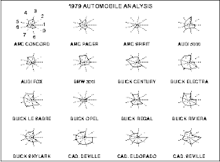
Star plots a graphical representions of a variety of different data about a single thing. This Star plot shows the differences between automobiles in 1979, everything from price, to safety, to gas milages was shown in a way to visualize the best buy of the model year.
http://www.itl.nist.gov/div898/handbook/eda/section3/gif/starplot.gif

Correlation matrix


Correlation matrixes use statistics to show the linear strength between two different sets of data, represented on both the axis. This Correlation table shows a medical patients reaction to different prescriptions as a useful tool in the diagosis of disease. http://www.kltprc.net/policynotes/Gifs/Tab_005A_4.gif

Similarity matrix


Similarity matrix is a comparison between two different sets of data points and is shown in a matrix. The more discolored the data is then the greater the difference between the two data points. These are especially useful in the medical field in comparing different sets of DNA as shown by this example.

Stem and leaf plot


Stem and Leaf Plots are used to help numerically organize data. The Stem is typically the place holder while the stem represents the second number as well as the frequency of the stem. Stem and Leaf plots are useful for seeing a graphical representation of a series of data. http://www.uow.edu.au/student/attributes/statlit/modules/images/2_50.gif

Box plot


Box Plots are used to group data into typically five quadreds, and use a measure to show the 25% to the 75% percentile. Box Plots are excellent at finding averages and medians of data sets such as this Box Plot which was used by the EPA to help explain groundwater acidity. http://www.epa.gov/OWOW/monitoring/volunteer/stream/images/fig64.jpg

Histogram


Histogram are sets of frequenced data. The more times that a variable comes up the higher tha the bar will be for that variable. As this Histogram shows, this is extremely useful in business and in this example used to predict sales. http://www.vertex42.com/ExcelArticles/mc/Images/ScreenCaptures/SalesForecast-Histogram.gif

Parallel coordinate graph


Parallel coordinate graphs are used to show numerous amounts sets of data. This graph shows the genes to cell ratios. Each line is a different variable and every line has a connection all the way through the graph. This was found on: